Logo Color Combinations: Four Useful Brand Directions
Learn how to choose a logo palette by brand role, with real examples of cool tech, natural, warm premium, and playful color directions.

A logo palette works when it supports a clear brand role. These examples use different brand concepts rather than recoloring one identity. Color has to fit what the audience expects and where the logo will appear.
Choose a color job before choosing a color
Color can help a new brand feel established, energetic, natural, technical, quiet, or expressive. Pick the role first. A restrained palette may help a complex product feel easier. A bright accent may help a small icon remain recognizable. An earthy green can support a nature-led story, but only when the rest of the identity avoids generic leaf-brand conventions.
Write the job as a sentence: “The palette should make a technical product feel approachable without losing precision.” That instruction is more useful than “use a nice blue.”
How to read the examples: compare the two brands within each direction, then compare the jobs across directions. The colors change because the brand context changes.
Direction one: cool tech blues
Flowpilot and Nexora are both software concepts, where blue can suggest clarity and technical confidence. Because blue is common in this category, the structure of the mark has to do more of the identifying work. Keep the palette narrow enough that the identity still works in a small interface.
Flowpilot
For a SaaS brand built around flow, the blue gradient adds speed to the F. A dark wordmark keeps it dependable in product UI.
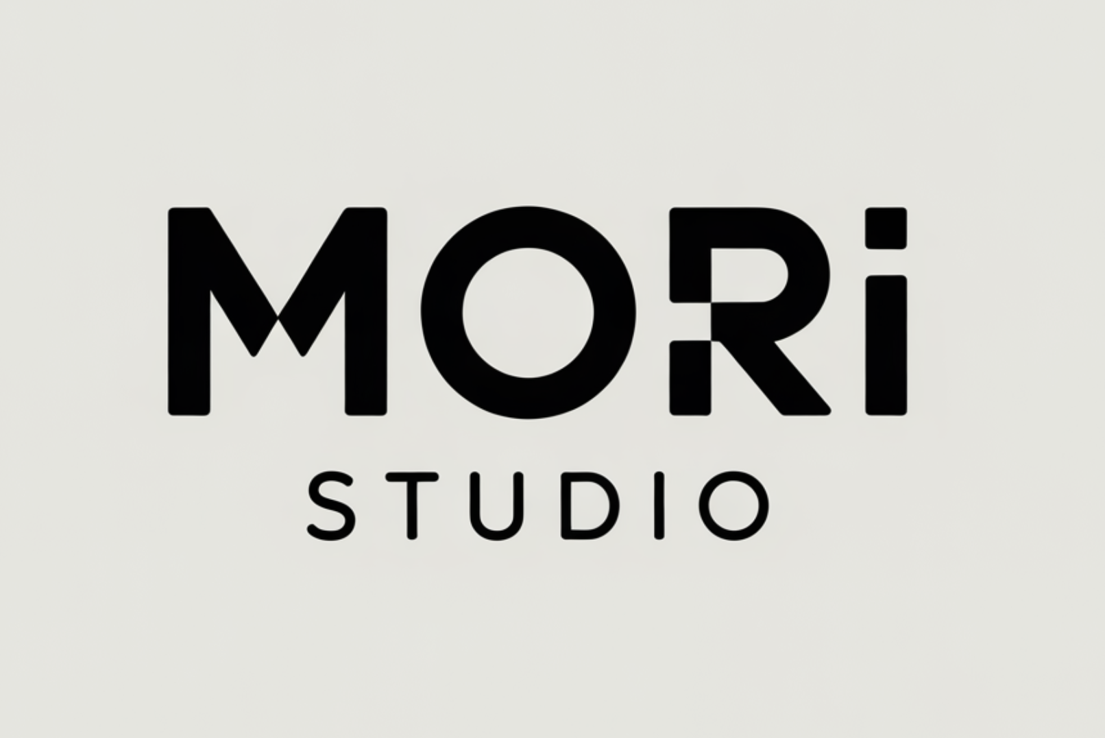
Nexora
Nexora uses a brighter ribbon mark for energy, then anchors it with dark type so the tech identity still feels clear.
Direction two: botanical and grounded
Bloomnest and Mossnest sit in the home, garden, and natural lifestyle space. Forest, moss, and sage tones suit that context when warm neutrals and strong type support them. Use one dominant green rather than several similar shades, or the identity can quickly turn muddy.

Bloomnest
For a home and lifestyle brand, earthy green makes the botanical mark feel calm and lived-in without drifting into rustic.
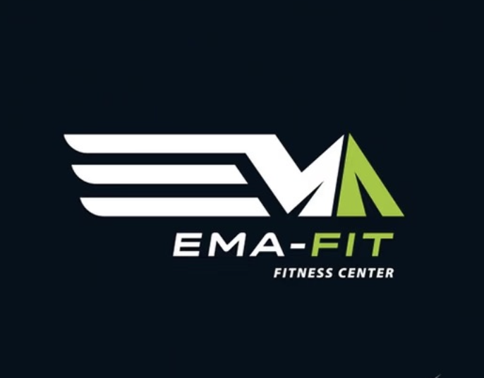
Mossnest
This home and garden concept uses one forest green across the leaf detail and serif letters, keeping the identity grounded and easy to reproduce.
Direction three: warm premium restraint
Nice Café grounds this direction in premium hospitality, while Luma shows how the same restraint can suit a broader luxury concept. Gold, sand, and warm neutrals work best as quiet signals. Give the accent room to breathe instead of adding gradients, shadows, and ornament at the same time.
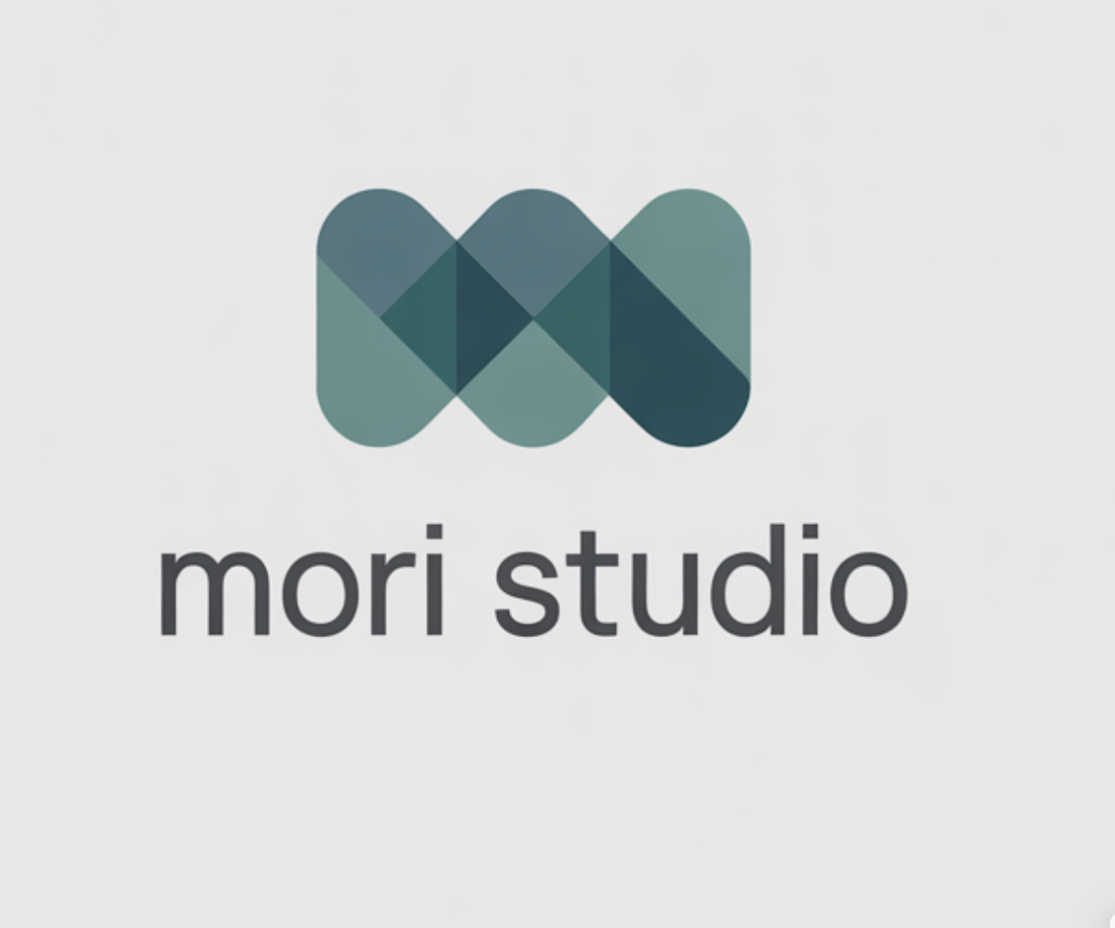
Nice Café
A premium café can use warm gold as a small signal of hospitality. Limiting it to the monogram and type lets the mark breathe.
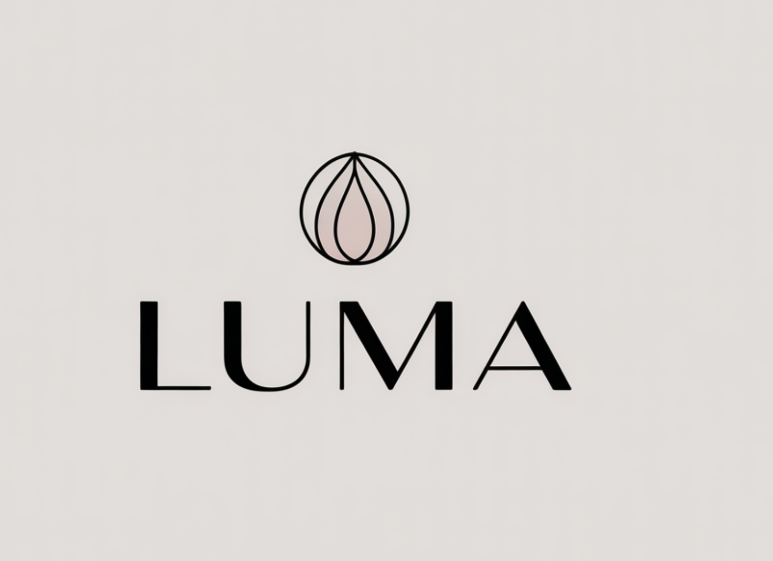
Luma
Luma takes the same restrained route for a broader luxury concept. Quiet neutrals leave the sphere and high-contrast serif to carry the refinement.
Direction four: playful contrast
Pawmilo and Pawvoro are pet-brand concepts, where warmth needs to register quickly on packaging, a shop page, or a social avatar. One memorable hue plus a warm secondary tone is usually enough. Shape and expression can carry the rest of the personality.
Pawmilo
For a pet brand that needs warmth at first glance, saturated blue creates a clear focal point while the rounded puppy carries the friendliness.
Pawvoro
Amber and brown make the illustrated dog feel warmer, while the darker wordmark keeps the pet identity readable.
Test the palette as a system
Check the mark in full color, one color, black, and reversed on a dark background. Then test it at favicon size and beside real interface or packaging colors. The logo should not depend on a subtle gradient to remain recognizable.
- Keep a one-color version for practical reproduction.
- Protect text contrast wherever the wordmark appears on the web.
- Define one dominant color, one support color, and a neutral before expanding the palette.
- Use color to clarify hierarchy, not to rescue an unclear shape.
Try the direction
Turn the next clear decision into four logo concepts.
Bring the audience, personality, and constraints. LogoFunny will help you explore distinct directions and refine the one that fits.
Open LogoFunny Studio